Project:
Watson Experience Guide
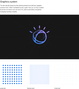
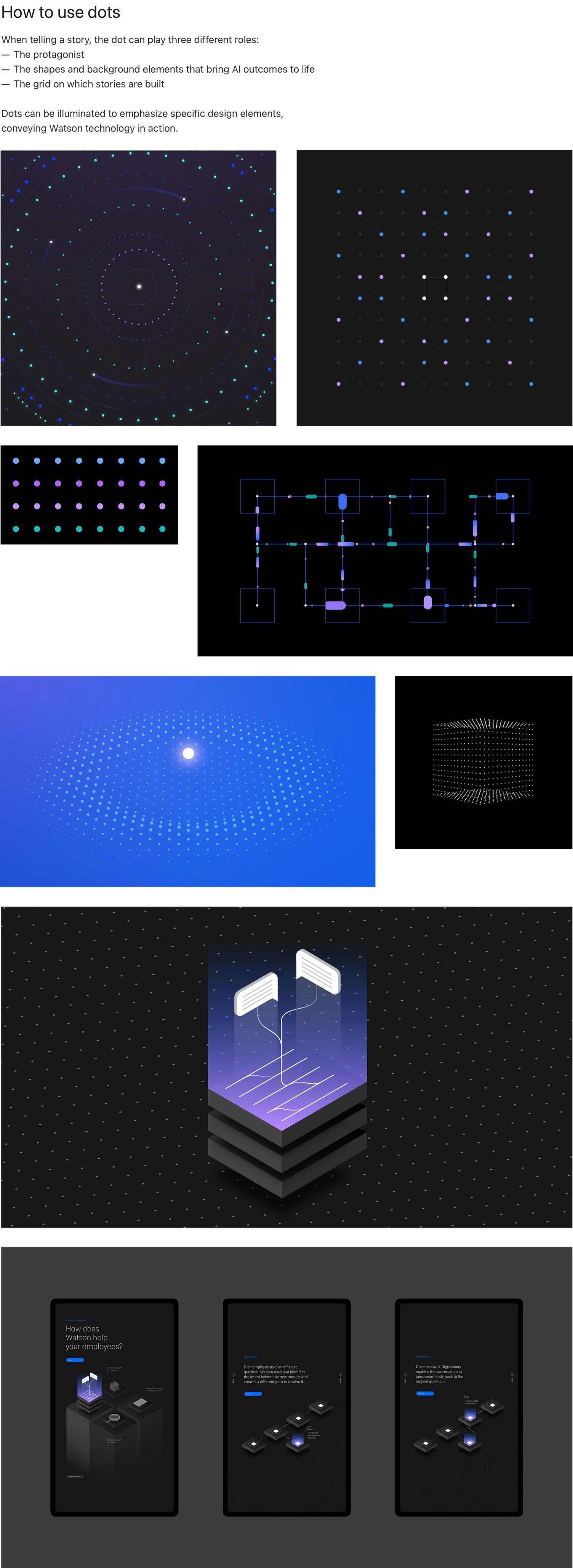
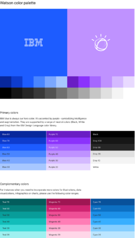
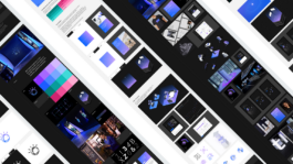
IBM Watson Experience Guide provides you with guidelines for the IBM Watson brand strategy, visual elements, and assets. Functioning as a playbook that provides information on how to tell the Watson (AI) and Data story, visual brand elements, guidelines and assets. The Experience Guide is meant to firstly, create a shared understanding of what the IBM Watson brand stands for. And secondly, to build a unified brand experience across all interactions and touch points, for Watson and other Data and AI experiences.
So how do we define key information to understanding IBM Watson’s brand? How can we optimize IBM branding throughout all extensions? This undertaking required massive collaborative effort between developers, designers, as well as cooperation from the internal IBM team to provide feedback on their vision.
Studio:
Client:
Creative Director:
AKQA
IBM
Tim Shelley
Associate Director:
Motion Designer:
Designer:
Caroline Hilman
Ryan Jones,
Carissa The,
Shaun Abernathy
Mika Park
Problem
IBM has 2000+ designers globally who are required to uphold its brand system, which is why a broader brand system is required whenever a new product launches. To avoid usage of outdated assets and elements, the experience guide is presented as a solution, as it provides updates on the present and is an accessible resource.
One of the driving force behind the Experience Guide is the need for a broader brand system for newcomers joining the team. IBM has a very specific guideline for its products; but on the contrary, the internal team is not as familiar with the IBM brand system due to a lack of awareness of updates—this resulted on outdated assets and elements often being utilized, posing a problem in maintaining present standards.
Research
There is an overall lack of understanding of the brand system and how to utilize it for extensions. There no universal resource that can be accessed by all users; and for a brand with the scale that IBM has, it is evident that this is a massive pain point.
One of the driving force behind the experience guide is the need for a broader brand system for newcomers joining the team. IBM has a very specific guideline for its products; but on the contrary, the internal team is not as familiar with the IBM brand system due to a lack of awareness of updates—this results on outdated assets or elements often being utilized, posing a problem in maintaining present standards.
1. Outdated guidelines are being used.
2. Users don’t know what’s changed and when.
3. Lack of visibility in its core audience.
Opportunity — Not only was this project important because it was part of the top request following the launch of IBM Carbon site that was done prior, but it also provided tremendous value to IBM users. We saw the experience guide as a way to increase productivity in teams as they will be able to fully access existing resources and guidelines in one live site. The opportunity for IBM in specific: the experience guide is a way to maintain the brand with the least friction.
Explorations and Iterations
Initially, I first thought of the different needs of the core target users. As the experience guide will be regularly updated, depending on feedback and new extensions; it is imperative to have a foundation that is adaptable to change.
Gallery pattern — Throughout the project, we had multiple sprints, and will also continue to have more in the future. Which was why it was so important to have a layout that can cater quickly to those changes. The Gallery page is the most distinct page designed as it has a different layout compared to the standard guideline pages. I explored different compositions and ultimately landed on several module sizes to be used when updates require for layout changes. As the Gallery page is always updated. creating a set pattern as to how each section graphics is displayed is beneficial for both the dev and designers. During the first sprint, we recognized this issue and created a set of pattern for the Gallery page — which also works to scale in the other pages.
Design System
The user interface is designed based on the rules of Carbon, which is IBM’s open source design system for products and digital experiences. With the IBM Design Language as its foundation, the system consists of working code, design tools and resources, as well as human interface guidelines.
Carbon Design System — Using the Carbon system as a strict guideline, the UI is based on the components and functionality of the Carbon system. For a more in depth look:
Reflections
This was one of the most extensive project that I’ve ever worked on. In addition to the IBM Watson Experience Guide being launched, the IBM Cloud Experience Guide was also simultaneously launched. The Experience Guide is to be utilized as a resource format to any new products that IBM launch.
The importance of a broader brand system — With 2000+ users globally, an accessible broader brand system that has all the key information and contacts is crucial to the overall brand maintance. I continously worked with the internal IBM team regarding content placement and distribution; and conducted testing as to whether the right information is being displayed for the users needs.
Communicating with devs while designing is essential — During sprints and maintance, I made sure to constantly work with the dev team to gauge on technical feasibility, timelines, and capabilities. I find that it was best to streamline the process the best I could very early on so everyone can focus on each of our tasks with the least friction. Utilizing Zeplin and Jira were especially helpful since this reduced meeting times and increased our productivity.
Articulating the process — As a designer, I have to be able to very clearly explain my decisions and the reasoning behind the process; since if I could not articulate it, I cannot expect my team to be able to understand it. This was especially true whenever I became the only designer available during parts of this project.
Future plans — IBM Cloud Experience Guide launched shortly after the success of IBM Watson Experience Guide. The concept of the Experience Guide will also be utilized for new products that IBM will launch.
IBM Cloud Experience Guide — Provides guidelines for the IBM Cloud brand strategy, visual elements, and assets.
Project:
Watson Experience Guide
IBM Watson Experience Guide provides you with guidelines for the IBM Watson brand strategy, visual elements, and assets. Functioning as a playbook that provides information on how to tell the Watson (AI) and Data story, visual brand elements, guidelines and assets. The Experience Guide is meant to firstly, create a shared understanding of what the IBM Watson brand stands for. And secondly, to build a unified brand experience across all interactions and touch points, for Watson and other Data and AI experiences.
So how do we define key information to understanding IBM Watson’s brand? How can we optimize IBM branding throughout all extensions? This undertaking required massive collaborative effort between developers, designers, as well as cooperation from the internal IBM team to provide feedback on their vision.
Studio:
Client:
Creative Director:
AKQA
IBM
Tim Shelley
Associate Director:
Motion Designer:
Designer:
Caroline Hilman
Ryan Jones,
Carissa The,
Shaun Abernathy
Mika Park
Problem
IBM has 2000+ designers globally who are required to uphold its brand system, which is why a broader brand system is required whenever a new product launches. To avoid usage of outdated assets and elements, the experience guide is presented as a solution, as it provides updates on the present and is an accessible resource.
One of the driving force behind the Experience Guide is the need for a broader brand system for newcomers joining the team. IBM has a very specific guideline for its products; but on the contrary, the internal team is not as familiar with the IBM brand system due to a lack of awareness of updates—this resulted on outdated assets and elements often being utilized, posing a problem in maintaining present standards.
Research
There is an overall lack of understanding of the brand system and how to utilize it for extensions. There no universal resource that can be accessed by all users; and for a brand with the scale that IBM has, it is evident that this is a massive pain point.
One of the driving force behind the experience guide is the need for a broader brand system for newcomers joining the team. IBM has a very specific guideline for its products; but on the contrary, the internal team is not as familiar with the IBM brand system due to a lack of awareness of updates—this results on outdated assets or elements often being utilized, posing a problem in maintaining present standards.
1. Outdated guidelines are being used.
2. Users don’t know what’s changed and when.
3. Lack of visibility in its core audience.
Opportunity — Not only was this project important because it was part of the top request following the launch of IBM Carbon site that was done prior, but it also provided tremendous value to IBM users. We saw the experience guide as a way to increase productivity in teams as they will be able to fully access existing resources and guidelines in one live site. The opportunity for IBM in specific: the experience guide is a way to maintain the brand with the least friction.
Explorations and Iterations
Initially, I first thought of the different needs of the core target users. As the experience guide will be regularly updated, depending on feedback and new extensions; it is imperative to have a foundation that is adaptable to change.
Gallery pattern — Throughout the project, we had multiple sprints, and will also continue to have more in the future. Which was why it was so important to have a layout that can cater quickly to those changes. The Gallery page is the most distinct page designed as it has a different layout compared to the standard guideline pages. I explored different compositions and ultimately landed on several module sizes to be used when updates require for layout changes. As the Gallery page is always updated. creating a set pattern as to how each section graphics is displayed is beneficial for both the dev and designers. During the first sprint, we recognized this issue and created a set of pattern for the Gallery page — which also works to scale in the other pages.
Design System
The user interface is designed based on the rules of Carbon, which is IBM’s open source design system for products and digital experiences. With the IBM Design Language as its foundation, the system consists of working code, design tools and resources, as well as human interface guidelines.
Carbon Design System — Using the Carbon system as a strict guideline, the UI is based on the components and functionality of the Carbon system. For a more in depth look:
Reflections
This was one of the most extensive project that I’ve ever worked on. In addition to the IBM Watson Experience Guide being launched, the IBM Cloud Experience Guide was also simultaneously launched. The Experience Guide is to be utilized as a resource format to any new products that IBM launch.
The importance of a broader brand system — With 2000+ users globally, an accessible broader brand system that has all the key information and contacts is crucial to the overall brand maintance. I continously worked with the internal IBM team regarding content placement and distribution; and conducted testing as to whether the right information is being displayed for the users needs.
Communicating with devs while designing is essential — During sprints and maintance, I made sure to constantly work with the dev team to gauge on technical feasibility, timelines, and capabilities. I find that it was best to streamline the process the best I could very early on so everyone can focus on each of our tasks with the least friction. Utilizing Zeplin and Jira were especially helpful since this reduced meeting times and increased our productivity.
Articulating the process — As a designer, I have to be able to very clearly explain my decisions and the reasoning behind the process; since if I could not articulate it, I cannot expect my team to be able to understand it. This was especially true whenever I became the only designer available during parts of this project.
Future plans — IBM Cloud Experience Guide launched shortly after the success of IBM Watson Experience Guide. The concept of the Experience Guide will also be utilized for new products that IBM will launch.
IBM Cloud Experience Guide — Provides guidelines for the IBM Cloud brand strategy, visual elements, and assets.