
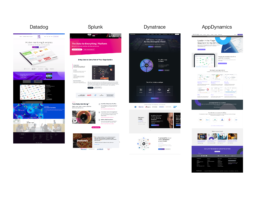
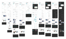
Direct competitors — New Relic’s direct competitors for reference.
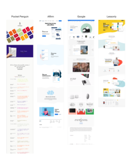
Additional websites — Differing approaches to site design for inspiration.
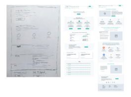
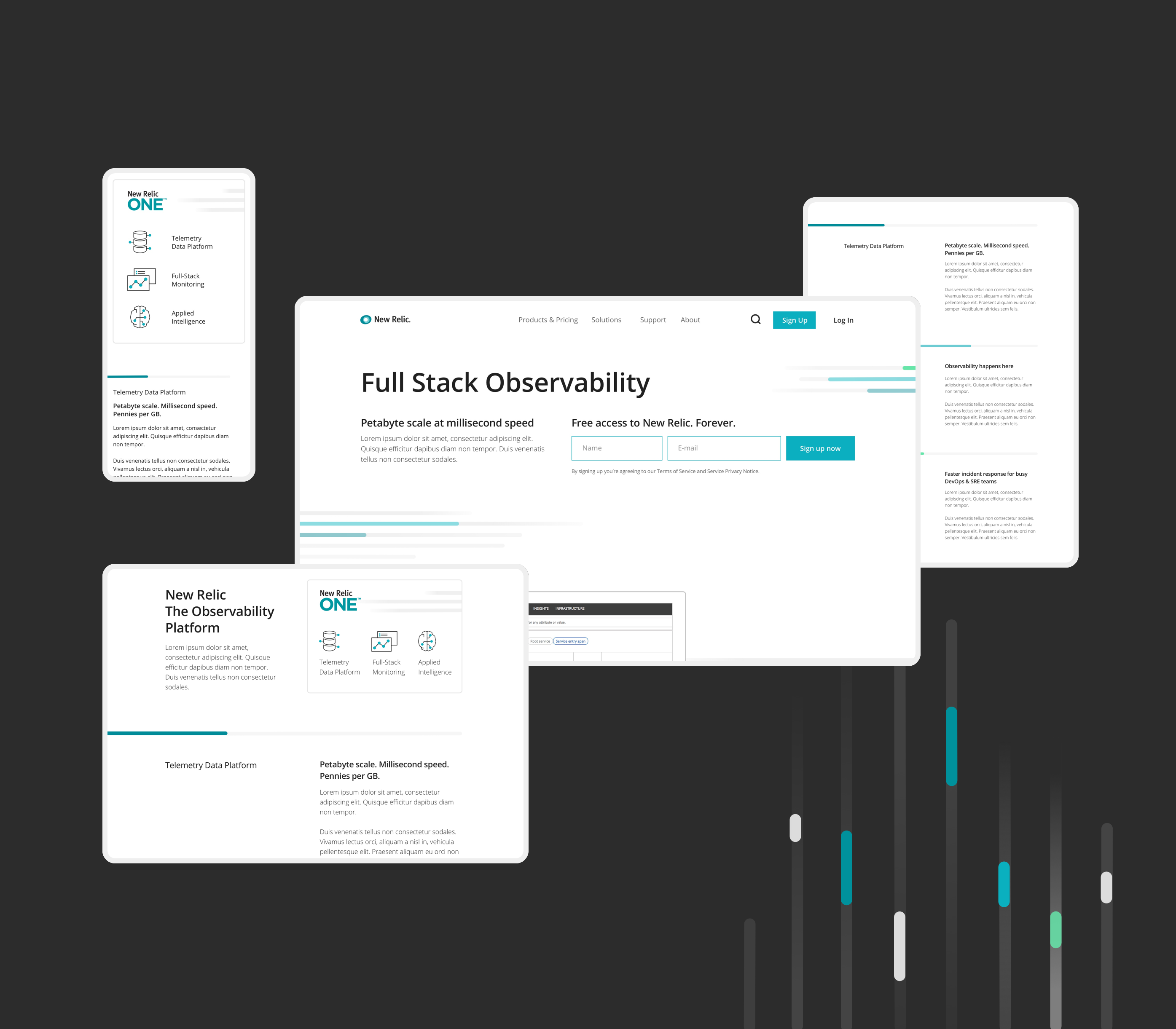
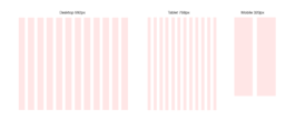
Early sketches — In the early stages, the focus is on content organization and hierarchy. We worked together with the internal design team in New Relic to identify the needs.
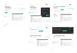
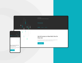
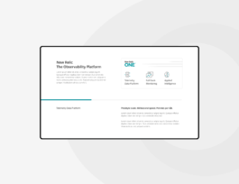
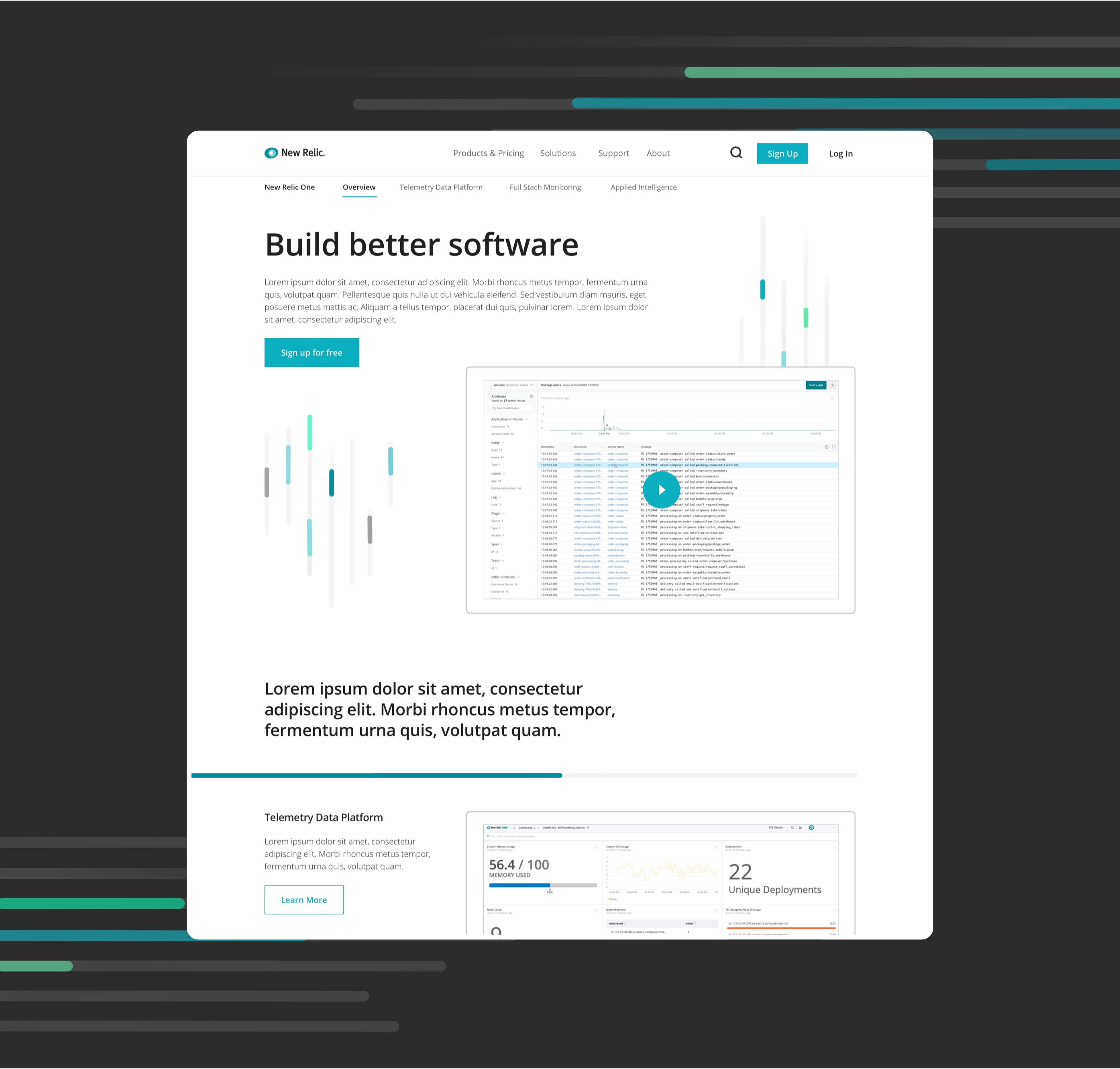
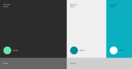
Homepage CTA — A last minute addition before delivery was to rethink the CTA module on the homepage, recognizing the need to draw attention to the CTA at first glance while still keeping things minimal, we tried several layout variations.
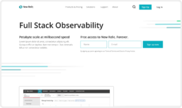
The strongest win — After testing it to a group of developers, Option C was the most successful. In summary, developers preferred when the CTA feels like an extension of the first paragraph module.
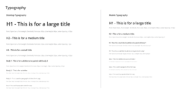
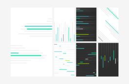
Typography — Only one typeface is used throughout the site, differing in size depending on the format and breakpoints.
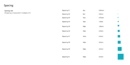
Spacing — Spacing is measured on multiples of 4, and is to be implemented with restraint.
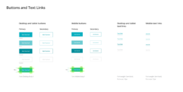
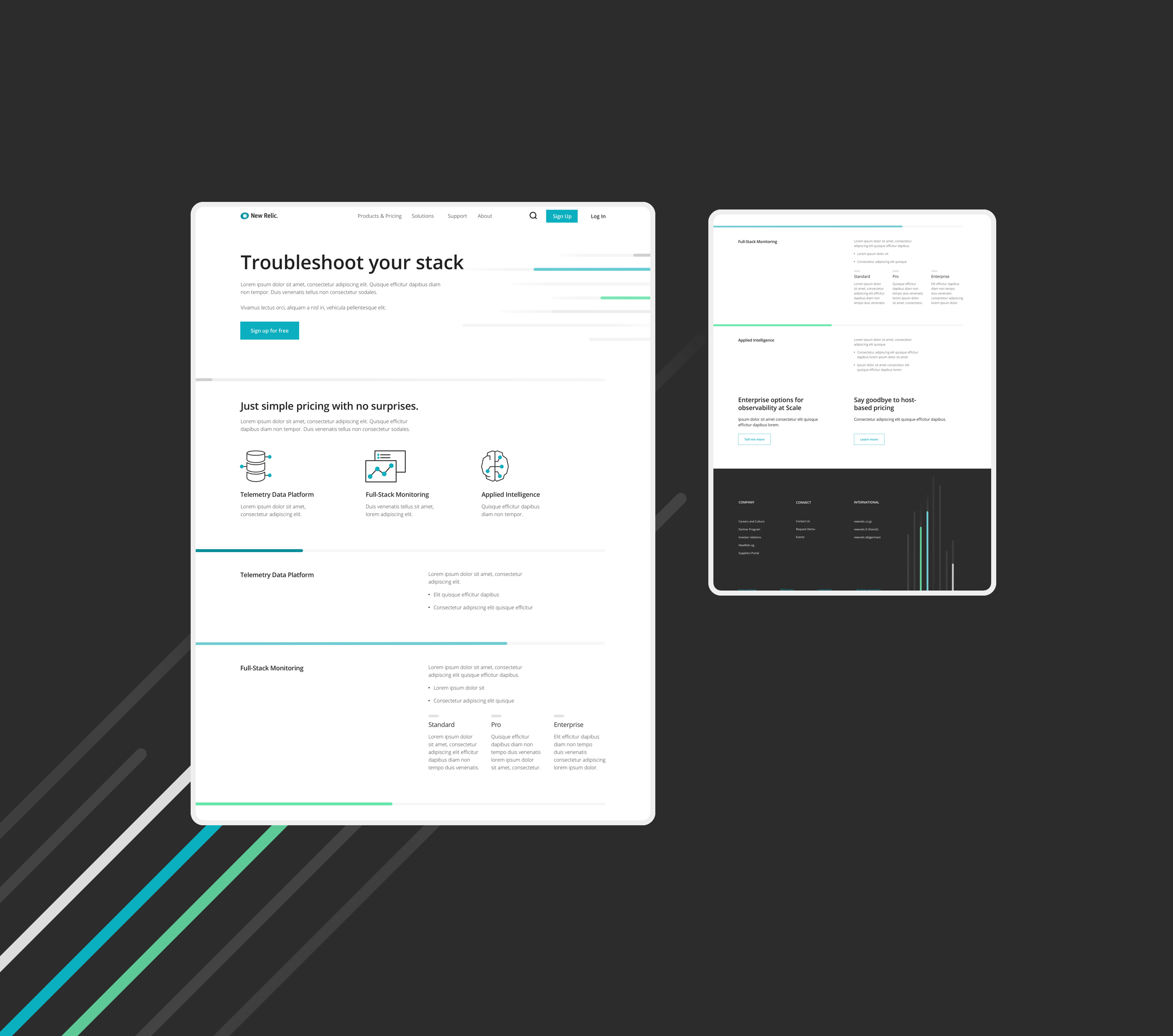
Buttons and Links — Different hover states for buttons and links according to breakpoints.
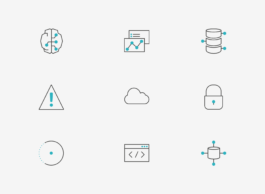
Iconography — The icon style is designed to flex to the various needs of the brand. Each icon expresses only essential characteristics and maintains a minimal form to represent the idea.
Direct competitors — New Relic’s direct competitors for reference.
Additional websites — Differing approaches to site design for inspiration.
Early sketches — In the early stages, the focus is on content organization and hierarchy. We worked together with the internal design team in New Relic to identify the needs.
Homepage CTA — A last minute addition before delivery was to rethink the CTA module on the homepage, recognizing the need to draw attention to the CTA at first glance while still keeping things minimal, we tried several layout variations.
The strongest win — After testing it to a group of developers, Option C was the most successful. In summary, developers preferred when the CTA feels like an extension of the first paragraph module.
Typography — Only one typeface is used throughout the site, differing in size depending on the format and breakpoints.
Spacing — Spacing is measured on multiples of 4, and is to be implemented with restraint.
Buttons and Links — Different hover states for buttons and links according to breakpoints.
Iconography — The icon style is designed to flex to the various needs of the brand. Each icon expresses only essential characteristics and maintains a minimal form to represent the idea.