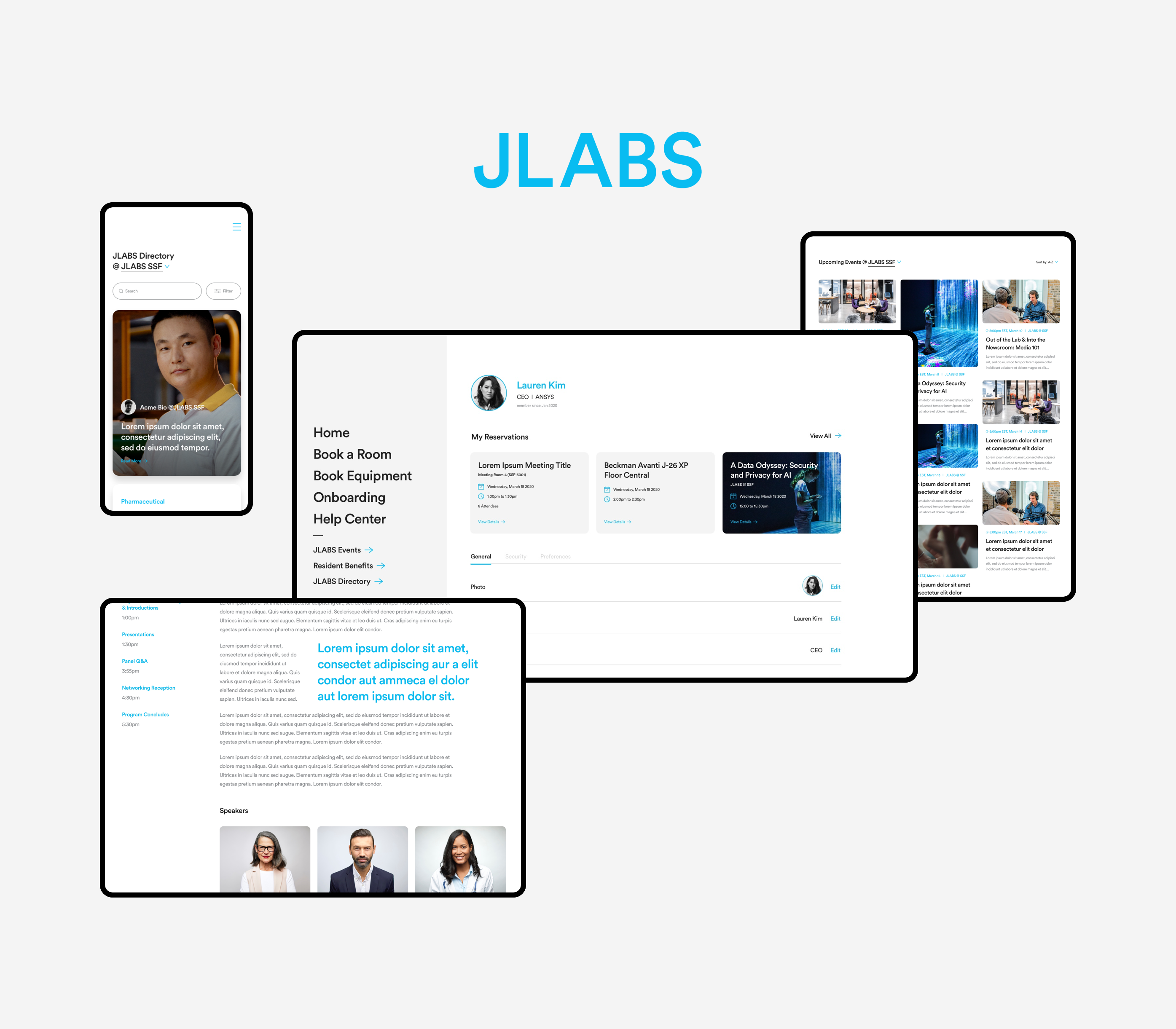
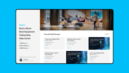
Fixed sidebar navigation — Condensing the navigation, the 5 main categories are features that users tend to look for when visiting the Juniverse site, while the secondary categories are centered on specific employee informations that the users might need to access
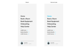
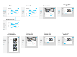
Viewing availability — Allowing users to view availability when booking a room/equipment early on intercepts the problem of running into availability issues at the end. Using a familiar calendar UI format, users are able to view all availability for the day at a glance.

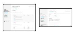
Streamlining the process — Users should be able to do everything they need to do in one page during each onboarding section, without having to take any additional steps.
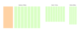
Grid System — The grid system is made in accomodation of different breakpoints for desktop 1920px, tablet 1440px and mobile 896px.
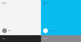
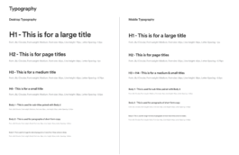
Typography — Only one typeface is used throughout the site, differing in size depending on the format and breakpoints.
Fixed sidebar navigation — Condensing the navigation, the 5 main categories are features that users tend to look for when visiting the Juniverse site, while the secondary categories are centered on specific employee informations that the users might need to access
Viewing availability — Allowing users to view availability when booking a room/equipment early on intercepts the problem of running into availability issues at the end. Using a familiar calendar UI format, users are able to view all availability for the day at a glance.
Streamlining the process — Users should be able to do everything they need to do in one page during each onboarding section, without having to take any additional steps.
Grid System — The grid system is made in accomodation of different breakpoints for desktop 1920px, tablet 1440px and mobile 896px.
Typography — Only one typeface is used throughout the site, differing in size depending on the format and breakpoints.